An update from the creators of the COVID-19 Curve Tracker
The Lown Institute is pleased to provide an update on the COVID Curve Tracker, a collaboration between Dr. Vikas Saini and Professor Tom Pike which was first announced with the publication of a preprint on medRxiv. The work was based on an observation Professor Pike had made while homebound and exploring public COVID data: that the growth in deaths from confirmed COVID cases in Italy seemed to be the same pattern seen in China. Exploration of other countries’ death rates seemed to indicate this was a more generalized phenomenon and might serve to provide useful information about the pandemic.
From Dr. Saini and Dr. Pike:
Since the publication, we have updated results daily and have extended our understanding and methods. We would like to address some common questions and concerns.
What is the Covid Curve Tracker project?
The Covid Curve Tracker examines the daily percentage change in the COVID-19 death rate for selected countries. Each country’s curve is aligned with a reference curve calculated daily from the average of other countries further ahead in the progress of their epidemic. Thus, the projected path for any given region is informed by the actual path taken by other regions.
Our total death and peak death projections are based on where each country falls on the reference curve. The arrival of each day’s data updates where upon the curve each country or region sits and thereby updates the death rate calculation. Every day that a country stays on the curve gives us another data point to estimate peak daily deaths and total deaths.
What information has the Curve Tracker uncovered so far?
The central observation is that when we track the percentage change in death rates, we are seeing a similar pattern in multiple countries. For example, the death rates in Italy, Spain, and several other countries have closely followed the trajectory seen in China after the Wuhan lockdown. As more observations are seen to follow previous patterns, we will be able to extend this analysis to more countries with heightened confidence.
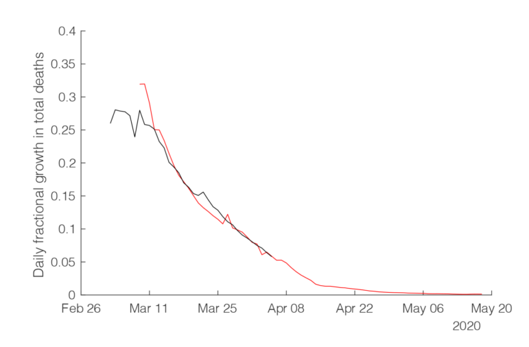
However, not all countries will follow a common trend, and differences could be revealing of changes in the progress of the epidemic in particular countries and regions. For example, the UK does not yet appear to be following the reference curve as closely as other countries, and thus the projections for total deaths for the UK have not been as stable as with other countries closely following the reference curve. Although we cannot with certainty attribute the declines we are seeing to lockdown implementation, we believe that tracking these curves will help monitor the course of this epidemic and allow some benchmarks for policy decisions.
Why does this pattern exist?
We posit that the pattern we are detecting is an emergent property of the complex forces and processes that make up the epidemic in the real world. We are not able to say with certainty what the pattern represents, other than to say the decline in the rate of change of deaths appears to be an underlying feature of how a COVID epidemic spreads in the countries we have studied to date.
In particular, we are not able to infer causality, that is, if social distancing is the reason for the growth declining. We can say that the curves of two countries are similar, and in particular if a country is following the same decline in growth seen in countries where social distancing was enforced.
What makes the COVID-19 Curve Tracker different from other models?
There are certain features that distinguish our analysis from other projects. Most other reports that have emerged in the past few weeks are based on the creation of complex models that take into account multiple variables like infection rate, fatality rate, susceptible populations, immunity, hospital capacity, using the best available estimates of these variables to explore the outcomes. But the fact is we don’t always have good knowledge of all these variables yet.
Our study is different because we are working with the known data as they are actually evolving, and using the best, though still imperfect, measure there currently is: the number of COVID-positive deaths in hospitals. Our results show a consistent pattern in the rate of deaths as the virus cycles through a region, and that is what we are trying to characterize more fully.
Rather than trying to use mathematical models to guess at how many people will contract the virus and die, we start at the other end: we look at the deaths and find a pattern. We then use that to calculate projections using observations from other epidemics. This method can be seen as a heavily supervised machine learning algorithm, using the experience of previous epidemics to improve the projection.